Product Reviews
Arc redefines web browsing
A new browser aims to change up how we experience the web and what a browser can do. BRYAN TURNER tried out Arc Browser.
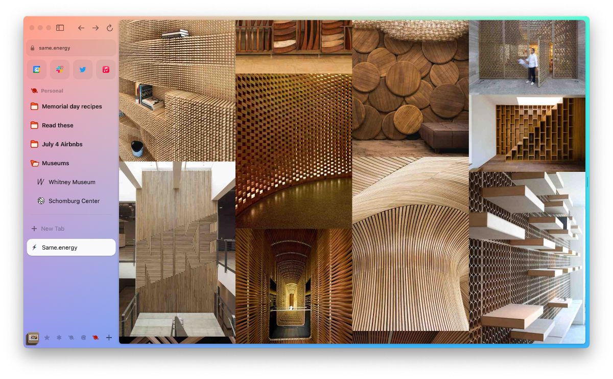
You know what a web browser looks like: tabs at the top, address bar and buttons below it, and the webpage itself. This layout has been tried and trusted in the web space, and all major browsers follow the formula. This format, however, becomes cumbersome as more apps move toward the web and the number of tabs increases.
Introducing Arc Browser, a new way to experience the web with a new layout that keeps users focused on the web. We got a chance to use the browser by signing up to its invite-only programme.
The Browser Company, developers of Arc Browser, says: “We blame ourselves for the browser’s shortcomings. When our browser has an overwhelming number of tabs, we call ourselves inefficient; when we get distracted online, we tell ourselves we need more discipline; when we can’t find a URL, we think we’re disorganised. Why does the browser get a free pass?”
Arc moves tabs to the left side in a scrollable list: enabling a virtually unlimited number of tabs and still being able to see the titles of each tab. Having more screen real estate on the side enables more functions, like creating tab groups to switch between, and the ability to hide that sidebar completely to have a clean, web-only view, which it calls Focus Mode. The sidebar responds well to multi-touch gestures, making it feel very natural: swipe up and down to see tabs, swipe left and right to go between groups of tabs.
Thanks to this increased screen real estate, users can put tabs side by side within a window in Split Mode. This is very useful for comparing two websites, and taking notes from one webpage in a document.
A useful feature we found with Split Mode is Easels: a way to clip portions of the web in a document. It’s essentially screenshots that are linked to the screenshot page, making it easier to get back to the referenced page. This feature is like a scrapbook for the web. We used it to create a holiday itinerary, with several booking options, a list of pros and cons, and several annotations (with its marker tool). If scrapbooking isn’t to your taste, there is also a simple note-taking feature built-in.
A big plus of the browser is its seamless integration between web and computer. With control + tab, one can switch between tabs as if they were windows in a desktop environment. This allows users to explore their tabs without using a cursor. The library feature shows a file explorer with previews, instead of just download names and file types.
For those with tab overload, auto-archive allows users to pin their most useful tabs to the top, while temporary tabs are cleared overnight. The interval can be changed to longer or shorter, or turned off completely. Users can also clear the temporary tabs with one click at the end of a browsing session.
The Browser Company’s team comprises ex-Instagram engineers, former heads of design at Tesla and Medium, multiple Google Chrome alums, a founding engineer of Amazon S3, and alumni from Snap, Slack, and Pinterest.
To join the Arc Browser waitlist, visit thebrowser.company


